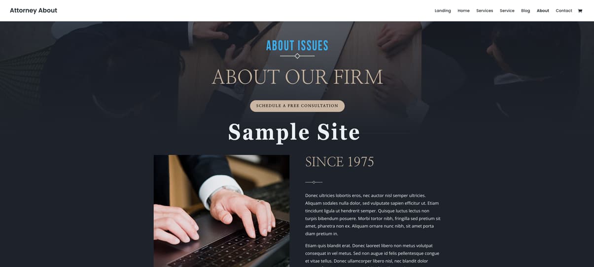
This page represents issues found on many sites
Since 1975
Donec ultricies lobortis eros, nec auctor nisl semper ultricies. Aliquam sodales nulla dolor, sed vulputate sapien efficitur ut. Etiam tincidunt ligula ut hendrerit semper. Quisque luctus lectus non turpis bibendum posuere. Morbi tortor nibh, fringilla sed pretium sit amet, pharetra non ex. Aliquam ornare nunc nibh, sit amet porta diam pretium in.
Etiam quis blandit erat. Donec laoreet libero non metus volutpat consequat in vel metus. Sed non augue id felis pellentesque congue et vitae tellus. Donec ullamcorper libero nisl, nec blandit dolor tempus feugiat. Aenean neque felis, fringilla nec placerat eget, sollicitudin a sapien. Cras ut auctor elit.
The fonts above are too small and hard to read–even for the average visitor
Our Attorneys

William Haines
Construction Accidents | Work-Related InjuriesMotor Accidents | Aviation Accidents

Axel Farrow
Motor Accidents | Aviation Accidents Product Liability | Slip and Fall Accidents
These are good profile photos (above)
Can you read the title (below)?
Experience You Can Trust
Vivamus id gravida mi, nec ullamcorper purus. Suspendisse ut nibh sagittis lacus viverra aliquam. Praesent ac lobortis mauris, non imperdiet quam. Praesent laoreet elit nisi, id feugiat ante accumsan sed. Vestibulum ante ipsum primis in faucibus orci luctus et ultrices posuere cubilia curae.
Lorem ipsum dolor sit amet, consectetur adipiscing elit.
Quisque aliquet velit sit amet sem interdum faucibus.
Luctus lectus non quisque turpis bibendum posuere.


Style, Color, Contrast, and Font Size All Matter
How does this text look?
How does this text look?
How does this text look?
How does this text look?
Watch out for text color and contrast
Background images can cause issues with readability
Call now for a Free Consultation
(255) 352-6258
LIght colors on light backgrounds often fail ADA contrast test
Client Reviews
★★★★★
“Ac feugiat ante. Donec ultricies lobortis “
★★★★★
“Quis blandit erat. Donec laoreet libero non metus volutpat consequat in vel metus. Sed non augue id felis pellentesque. Sed vitae nulla et justo pellentesque congue nec.”
Making columns more even will look better
★★★★★
“Luctus lectus non quisque turpis bibendum posuere. Morbi tortor nibh,
Office Hours
Daily – 9:30 am to 6:30 pm
Sunday – 08:00 am to 11:30 am
Holidays – 08:00 am to 3:00 pm

Poor branding or no branding lessens professionalism
Legal offices of Turner
Contact Info
1234 Divi St. #1000, San Francisco, CA 94220
(255) 352-6258
Make sure your text can be read on mobile and desktop devices and watch for the width size
Subscribe to our newsletter
Link one
Law Offices of Wilbur & Turner
Why Too Many Attorney Websites Fail Accessibility — And How to Fix Them
By Cara Harpole, Askadinya Launch
Recently, I decided to run a simple research exercise: I went online and looked at more than 20 attorney websites completely at random. You can try this yourself — take any last name like “Johnson” or “Smith,” add “attorney” and your city, and just start clicking. It doesn’t take long before you begin to notice the same patterns repeating across almost every site.
This wasn’t limited to one firm or one design style.
The issues were consistent, predictable, and often preventable.
I chose to focus on attorney websites because attorneys are professionals we look to for clarity, guidance, and solutions. Their websites should reflect that same clarity. And when an attorney’s website feels confusing, inconsistent, or inaccessible, it naturally leads to a quiet but important question:
If the digital experience isn’t clear, how will the client experience be?
This is not about criticism — it’s about awareness.
And there’s another reality worth mentioning:
In 2024 alone, over 4,000 lawsuits were filed in the United States for websites that failed basic accessibility standards.
Many of these cases involved businesses that unknowingly overlooked issues that affect real people — including older adults, visually impaired users, and individuals who depend on accessibility tools.
Common Problems Found on Attorney Websites
Through this review process, I noticed the same issues appear repeatedly across attorney sites. These issues also appear on many other business websites, but today the focus is on law firms — because accessibility and clarity matter even more when helping clients in moments of stress.
Below are the patterns I observed.
1. Low-Contrast Buttons & Hard-to-Read Text
Many sites use:
-
light text on light buttons
-
faint placeholder text in forms
-
pale link colors
-
serif fonts that appear thin or blurry on screens
Why it matters:
Low contrast is one of the biggest reasons people can’t read a website. It’s an immediate accessibility failure and a common point of frustration for older adults and visually impaired visitors.
2. Decorative or Stylized Fonts
I saw fonts that looked elegant but weren’t designed for screens.
This included:
-
script fonts
-
ultra-thin lettering
-
all-caps with tight spacing
-
fonts that shrink poorly on mobile
Why it matters:
Good typography should be invisible — the user shouldn’t have to work to read it.
3. Text Placed Over Busy Background Images
A major problem across attorney sites is placing text directly over scenic photos, courthouse backgrounds, or office images.
Why it matters:
When the background includes both dark and light areas, the text becomes unreadable. Users end up guessing what the sentence says.
4. Non-Responsive Layouts
Some sites that look decent on desktop completely fall apart on mobile:
-
images crop awkwardly
-
text shifts off-screen
-
buttons overlap
-
columns stack incorrectly
Why it matters:
Over 60% of users browse legal sites on their phones. If your mobile layout collapses, so does the message.
5. Uneven Client Reviews
Several review sections looked unbalanced:
-
paragraphs of different lengths
-
different font sizes
-
inconsistent spacing
-
alignment issues
Why it matters:
Reviews build trust — but only when presented clearly and consistently.
6. Poor or Missing Branding
Quite a few sites had:
-
logos that changed size between pages
-
inconsistent colors
-
generic stock photos
-
mismatched type styles
Why it matters:
Brand inconsistency quietly reduces credibility. Everything should feel like it belongs together.
7. Tiny Contact Sections
Contact forms and footers were some of the most problematic areas:
-
very small text
-
faint labels
-
poor spacing
-
confusing layout
-
unattractive or unfinished footers
Why it matters:
The contact section is the final step before someone reaches out.
It must be readable, clear, and inviting.
Why This Matters in Web Design Strategies
Every issue listed above affects:
-
clarity
-
trust
-
accessibility
-
user comfort
-
professional credibility
This is exactly why I created Web Design Strategies — a series where I break down design choices and show how small adjustments can dramatically improve communication.
Design isn’t just visual.
Design is communication.
Design is trust.
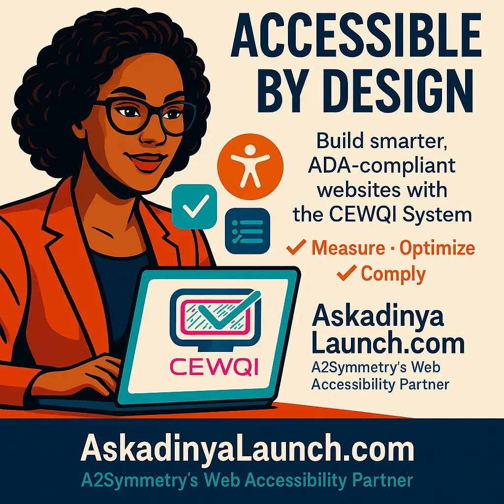
My Evaluation Method: CEWQI
To evaluate websites consistently, I developed CEWQI — Cara’s Extensive Web Quality Index.
This is not a technical tool or a coding framework.
It’s a practical scoring system that looks at design elements such as:
-
readability
-
layout
-
color contrast
-
font size
-
image usage
-
spacing
-
consistency
-
brand clarity
-
professionalism
In simple terms:
CEWQI helps translate “this website feels off” into clear, understandable reasons — and clear solutions.
I also created a checklist for business owners preparing for a website or redesign, so they don’t have to guess what matters or what to gather.
How Askadinya Launch Helps
This work forms the foundation of what I do at Askadinya Launch.
My goal is to help businesses — including law firms — create websites that are:
-
clear
-
readable
-
accessible
-
mobile-friendly
-
professionally branded
-
easy to use
-
aligned with ethical and ADA expectations
A website should work for everyone.
It should feel trustworthy.
It should reflect the professionalism of the people behind it.
And when it doesn’t, it can absolutely be fixed — with the right approach, the right intentions, and the right design strategy.
If your firm wants a website that is accessible, compliant, and genuinely helpful to the people you serve, Askadinya Launch is here to help you build it.